oPath
oPath, short for 'The Ottawa Path,' is a mobile app headquartered in Ottawa designed to simplify local shopping by providing a seamless delivery service from small to large retail shops directly to customers’ doors. In response to the challenges posed by the pandemic, oPath aims to help businesses generate revenue and keep customers safe by making home delivery accessible to small and medium-sized businesses.
01
Problem Statement
oPath needed a distinctive logo and brand identity to launch its mobile app, which aims to make local delivery accessible for small to medium-sized businesses. The challenge was to create a visual identity that would communicate convenience, reliability, and community support, helping oPath stand out in the market as a trusted delivery solution in Ottawa.
02
Solution
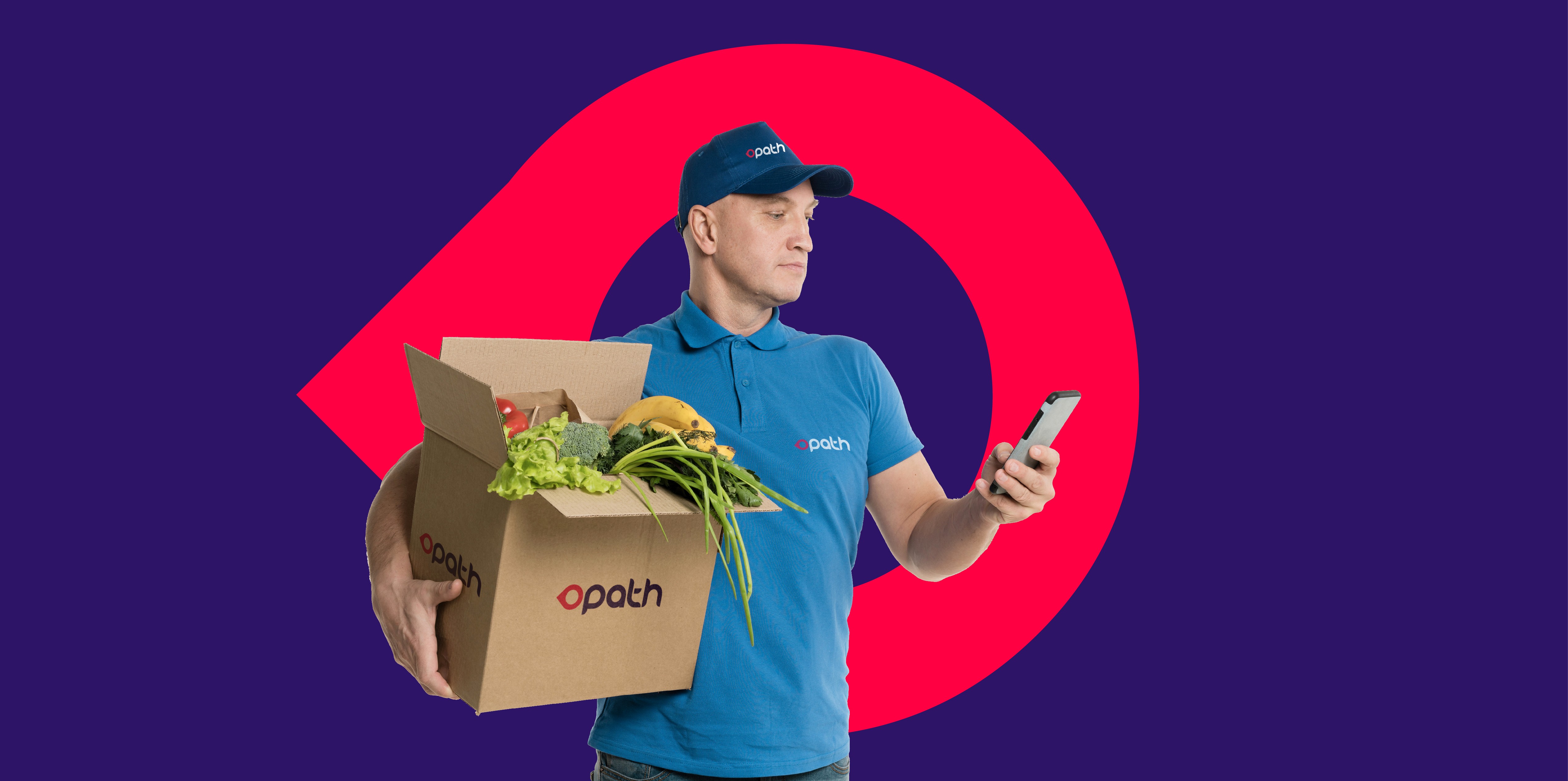
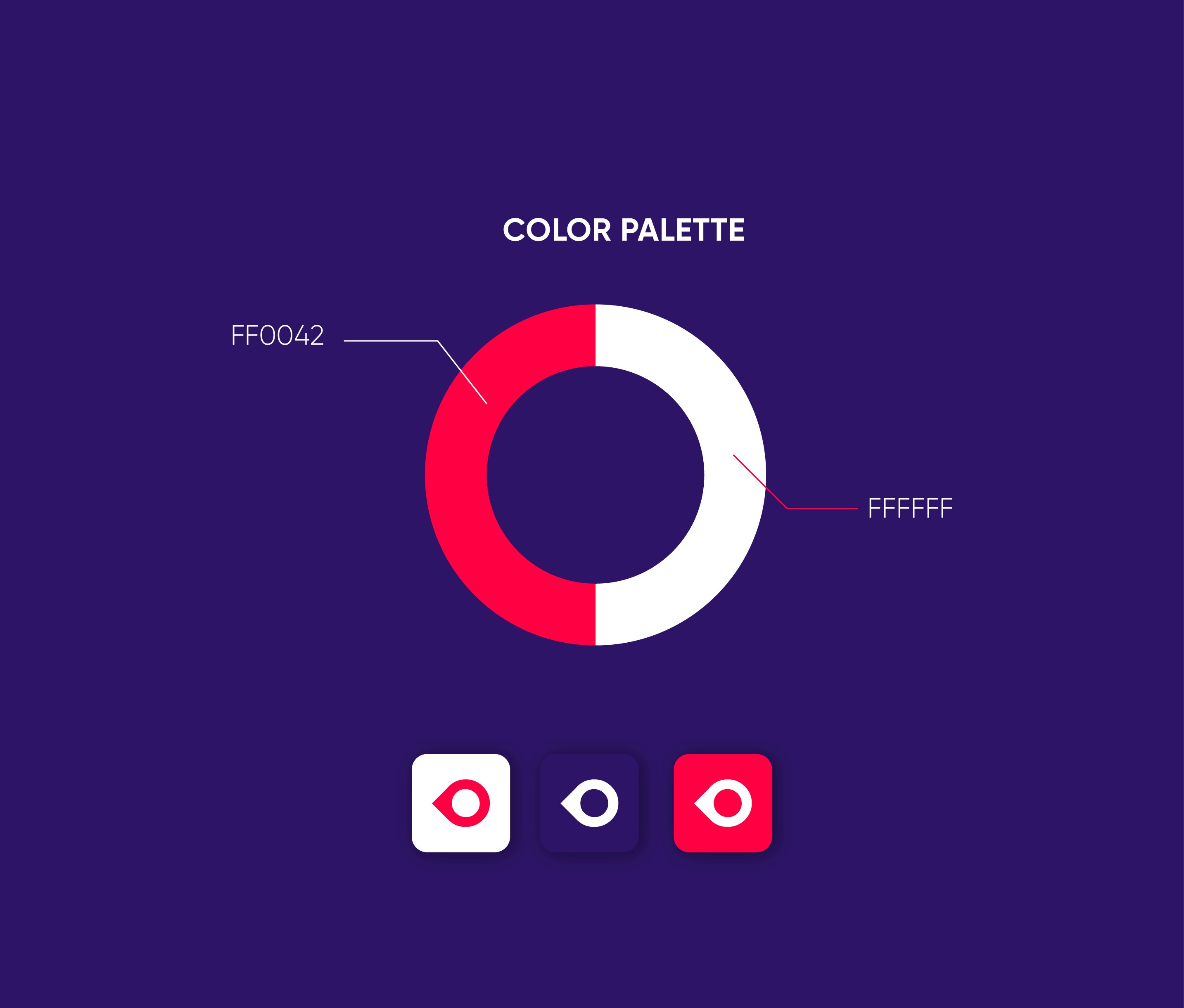
To establish oPath’s brand identity, I created a logo and visual design that reflect the app’s mission of supporting local businesses while providing convenience. The logo is modern and approachable, conveying reliability and a sense of community. I applied this cohesive design across various digital elements to ensure it resonates with users and showcases oPath’s commitment to safe, efficient, and accessible delivery for Ottawa’s local market.

03
Result
The new branding provided oPath with a distinctive identity that resonated with local businesses and customers alike. The cohesive look and feel helped position oPath as a reliable delivery solution, fostering trust and interest for a strong launch in the Ottawa market.


